HEALTH
HEALTH
Whitby & Co
Whitby & Co
At a Glance
- Three months after launch, the new Whitby & Co website saw a 20% increase in new eye care enquiries and a steady rise in prescription orders, while also growing its email database to support stronger customer retargeting and promotion of regular eye tests.
- A key learning from the project was the importance of close collaboration with external branding teams, with regular communication helping resolve UI challenges efficiently and ensuring accessibility considerations like colour contrast and typography were met to deliver an inclusive experience.
Background
Whitby & Co Opticians is an independent, community-focused eye care practice dedicated to delivering high-quality optical services with a personalised touch. The business centres on providing comprehensive eye examinations, expert clinical advice, and a carefully selected range of eyewear, including prescription glasses and contact lenses.
My Role
On this project, I led the discovery and ideation phases to define Whitby & Co Opticians’ new premium eyewear proposition, incorporating competitor analysis to identify market gaps and opportunities. Using these insights, I developed refined user journeys for key personas, created high-fidelity wireframes for stakeholder approval, and translated these into a polished user interface aligned with the updated brand identity.
The Challenge
Whitby & Co Opticians was created as a sister brand to Fleet Street Clinic, aiming to differentiate from its parent’s focus on personal and corporate healthcare by positioning itself within the premium eyewear market. Supported by a new brand identity from an external agency, the goal was to create a more design-led, upmarket digital experience.
The UX challenge was to design a website that balanced this new positioning with its clinical roots, while introducing a seamless e-commerce journey for purchasing prescription eyewear. This involved creating clear, intuitive user pathways, reducing friction in complex tasks, and ensuring trust across both healthcare and retail touch points.
Constraints
Midway through the project, Whitby & Co began a rebranding initiative which introduced new visual guidelines, including updated typography, colour palettes, and brand styling.
This meant the design work needed to adapt to the evolving brand direction while maintaining consistency across the new user interface. Close collaboration with the external branding agency was required to ensure the digital experience aligned with the new brand identity while still delivering an accessible and user-friendly website.


At a Glance
- Three months after launch, the new Whitby & Co website saw a 20% increase in new eye care enquiries and a steady rise in prescription orders, while also growing its email database to support stronger customer retargeting and promotion of regular eye tests.
- A key learning from the project was the importance of close collaboration with external branding teams, with regular communication helping resolve UI challenges efficiently and ensuring accessibility considerations like colour contrast and typography were met to deliver an inclusive experience.

Research
During the discovery phase, I conducted stakeholder interviews with the Managing Director and Marketing Manager at Whitby & Co to understand their vision for the brand, business objectives, challenges, and the strategic role of the new website.
I also carried out an analytics review of their sister site, Fleet Street Clinic, examining user behaviour through flow reports and page engagement metrics. This highlighted key drop-off points in the eye care enquiry journey and informed actionable recommendations for improvement.
In parallel, I conducted competitor analysis within the premium eyewear market, identifying features and experiences that could enhance Whitby & Co’s offering.
By combing insights from stakeholder interviews, analytics, and competitor research, I identified usability opportunities and shaped the structure of new user journeys. These findings informed the creation of user personas representing both existing customers and new audience segments targeted through the brand’s expansion into eye care.

Ideation
Following the discovery phase, I mapped each persona to their dedicated website journey, identifying key goals, primary paths, and potential friction points across the experience.
These journey maps informed the creation of a new sitemap and information architecture, ensuring the site structure supported core user journeys and made services and e-commerce features easy to discover.
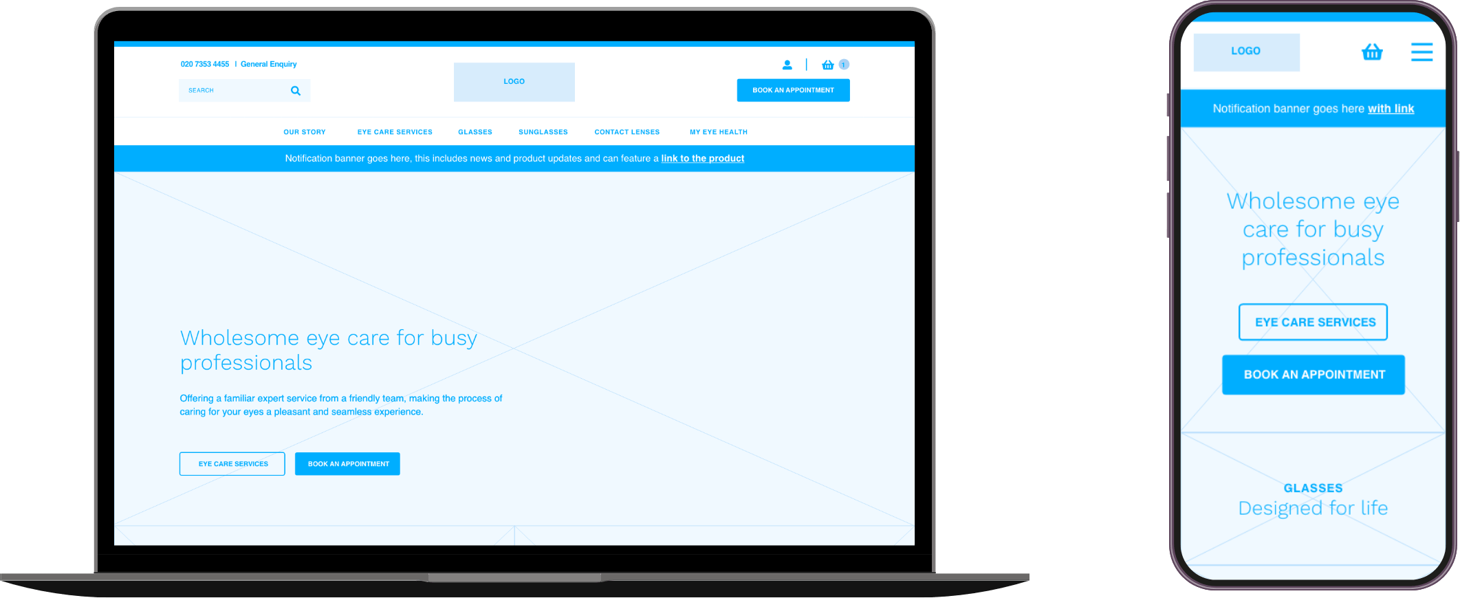
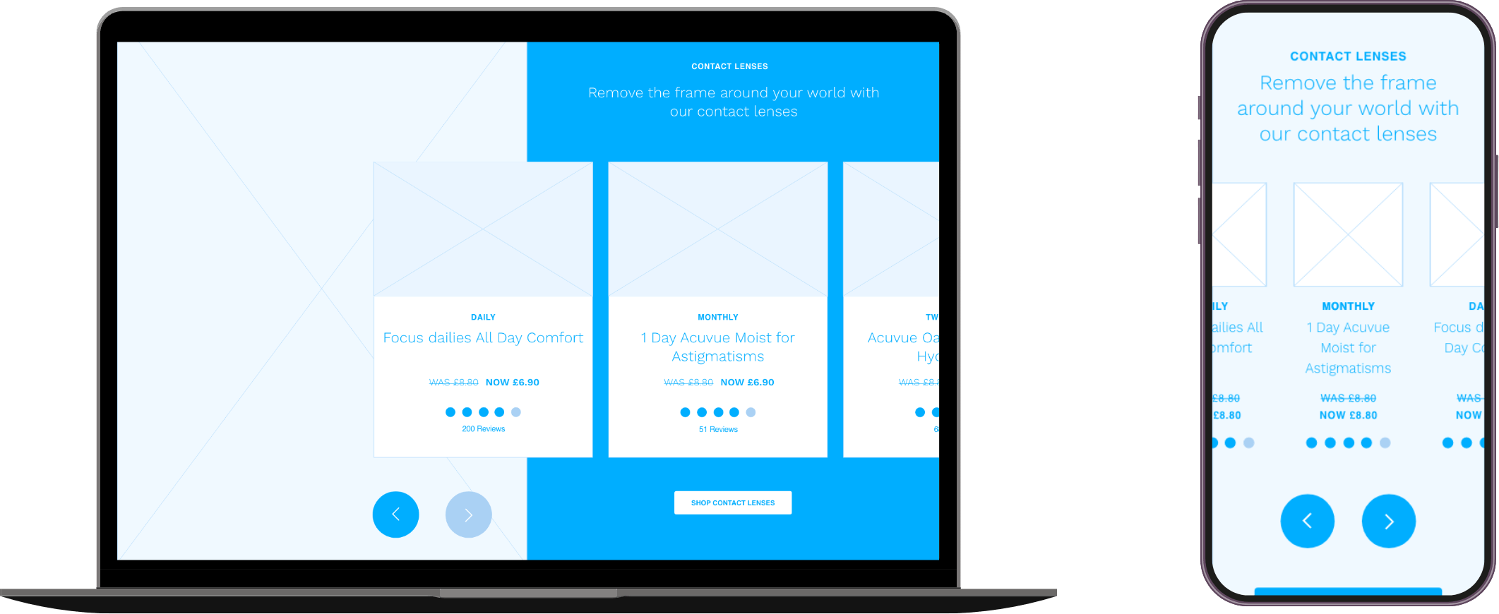
I explored multiple layout options through low-fidelity wireframes, allowing the team to review content structures and navigation approaches before developing high-fidelity wireframes of the final site.
Once the wireframes were complete, I conducted 1-to-1 walkthroughs with the Whitby & Co team to demonstrate how each persona could navigate the site intuitively and access key areas within their journey.

Delivery
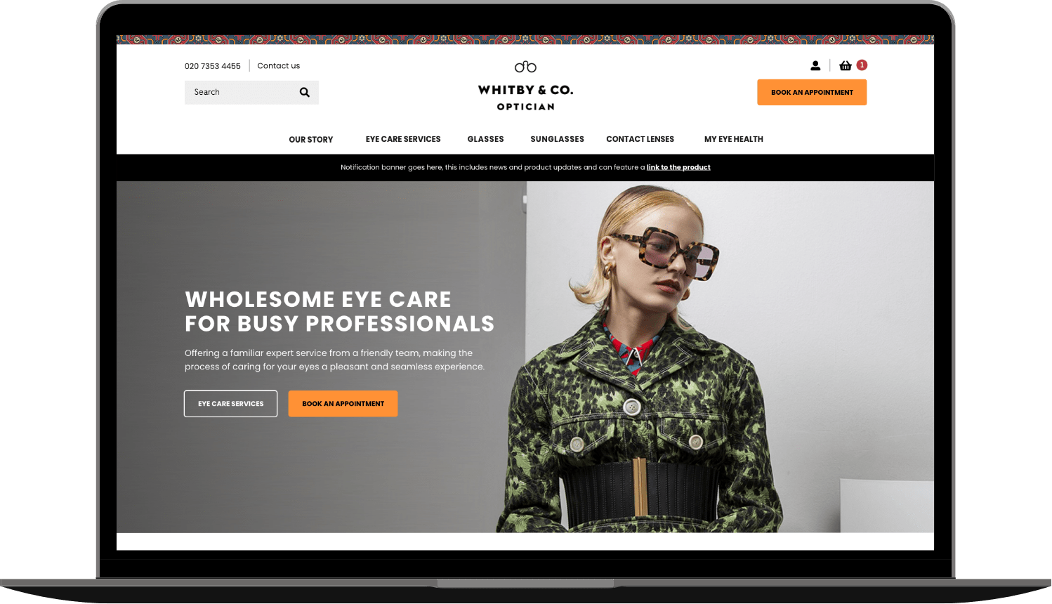
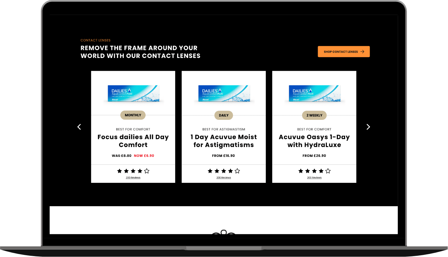
With the high-fidelity wireframes approved, I progressed to developing the final user interface, applying Whitby & Co’s updated branding guidelines from the rebranding process.
During the delivery phase, I produced key UX assets, including a responsive UI design, an interactive prototype, and a design system containing reusable components, typography, colour usage, and layout patterns to ensure consistency across the site.
I presented the interactive prototype to the managing directors to demonstrate the final user journeys and interface, securing final sign-off. Following approval, I handed over the design system, UI specifications, and annotated interface to the development team for implementation.
Wireframes
User Interface
Results & learnings
Three months after launch, the new Whitby & Co website achieved a 20% increase in new eye care enquiries and generated a steady flow of prescription orders. It also expanded their email database, enhancing opportunities for customer retargeting and promoting regular eye tests.
A key learning from the project was the value of close collaboration with external branding teams. Regular communication allowed us to resolve UI challenges efficiently, particularly around accessibility considerations such as colour contrast and typography, ensuring a seamless and inclusive user experience.

Results & learnings
A key learning from the project was the value of close collaboration with external branding teams. Regular communication allowed us to resolve UI challenges efficiently, particularly around accessibility considerations such as colour contrast and typography, ensuring a seamless and inclusive user experience.