MOTORING
MOTORING
Parkers
Parkers
At a Glance
Background
Parkers is a trusted automotive brand that helps people make confident decisions about cars. It provides expert reviews, car valuations, buying and selling advice, and detailed vehicle information, making it easier for drivers to choose, own, and sell cars with confidence.
My Role
On this project, I led the discovery and research phase to understand how users perceived the Parkers Valuations service, identifying key friction points and opportunity areas. I facilitated ideation around potential solutions, set the direction for proposed improvements, and oversaw user testing to validate assumptions and refine the final approach.
The Challenge
As part of ongoing optimisation of Parkers, we initiated a migration of key pages to a new framework to improve both SEO performance and overall user experience. However, the valuations service, particularly the custom valuations tool, had received consistent user complaints, highlighting issues across usability, interface design, and system-to-user communication.
These challenges pointed to gaps in clarity, feedback, and interaction design, creating friction in the user journey and impacting overall task completion.
A detailed review of the end-to-end journey uncovered multiple friction points, including unclear error messaging, inconsistent information based on user intent, and psychological pricing barriers that negatively impacted conversion. These issues disrupted user trust and hindered task completion at critical stages.
Addressing this required a holistic redesign of the experience and interface, focused on improving clarity, consistency, and transparency to restore confidence and drive better user and business outcomes.
Constraints
As this project ran alongside performance upgrades, specifically migrating key pages to a faster CMS, there were constraints on the time available for in-depth user polling and usability testing. This required a more iterative, insight-driven approach to validation, prioritising high-impact changes within limited research windows.
In addition, the design had to accommodate new advertising guidelines from third-party partners and internal teams, introducing further constraints on layout, content hierarchy, and component behaviour.
At a Glance

Research
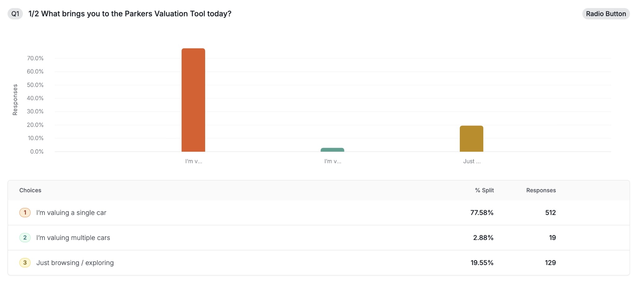
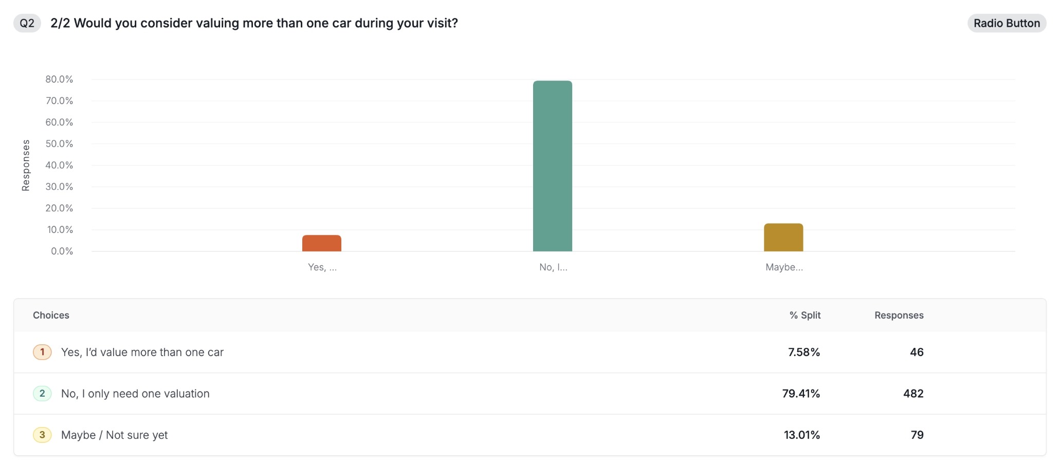
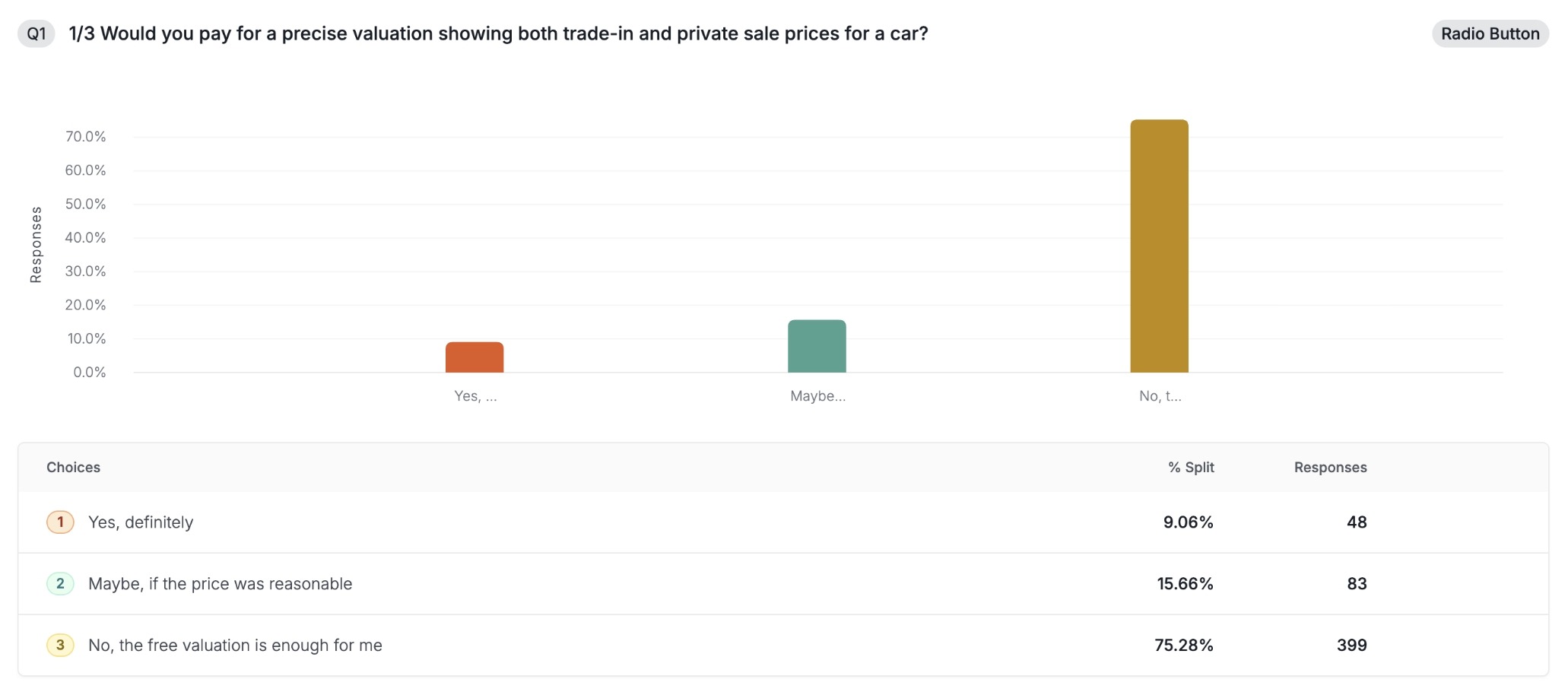
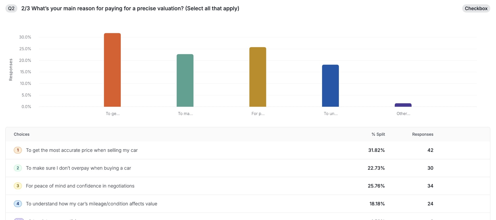
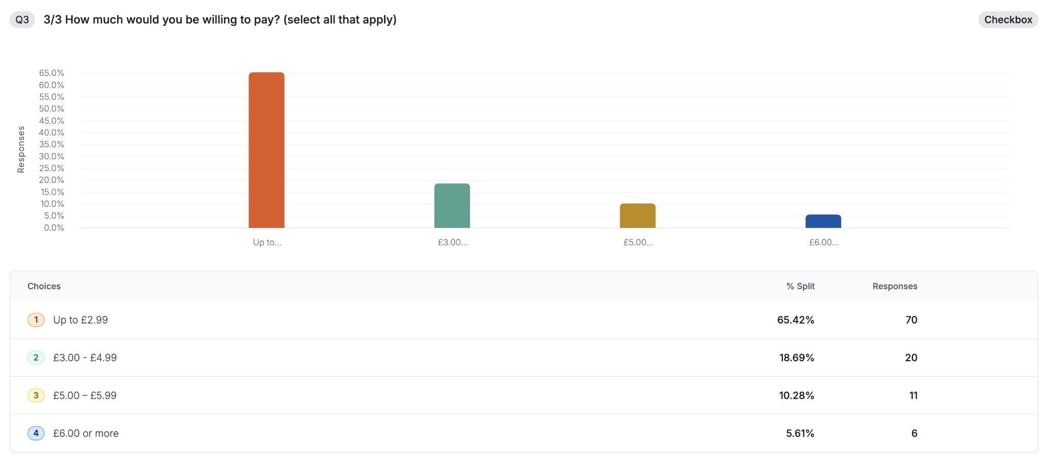
I began my research with a heuristic analysis of the current Valuations journey while running preliminary polls to validate the hypotheses derived from customer feedback. I then conducted interviews with existing customers to gain a deeper understanding of friction points.
I synthesised these insights and presented them to product and engineering, enabling the team to prioritise opportunities and define the scope of work needed to improve the experience.

Ideation
After collaborating with product and engineering, I designed two alternative user journeys aimed at reducing friction in the Valuations experience. One journey was defined as an MVP, delivering quick wins with minimal development effort, while the other represented an optimal experience that required additional engineering investment.
For both journeys, I assessed potential impact and estimated revenue uplift, demonstrating how improvements to UI and UX could drive better user outcomes and business value.

Testing
I tested both journeys using Figma prototypes in a virtual testing environment via Microsoft Teams, then collated the session transcripts with the support of ChatGPT to efficiently collate insights.
Both prototyped journeys demonstrated a significant uplift in satisfaction scores compared to the live site, and these findings were shared with stakeholders to inform a final decision on next steps.
Surveys
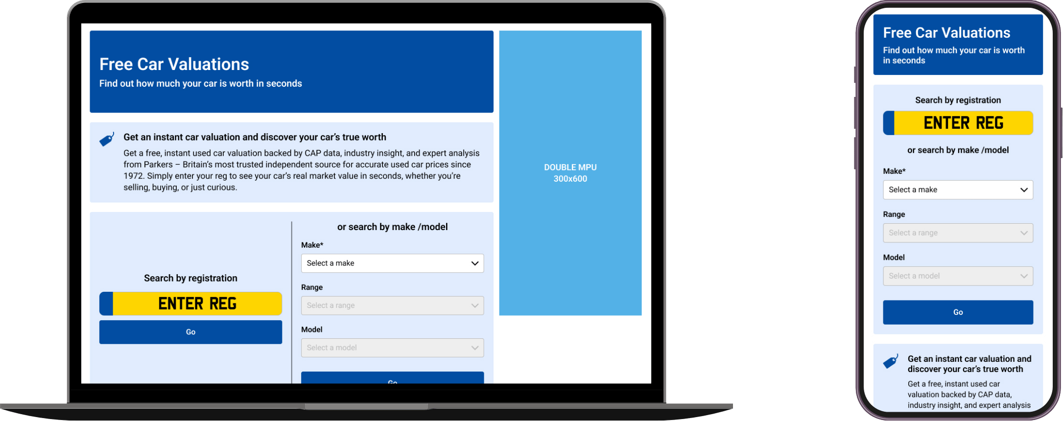
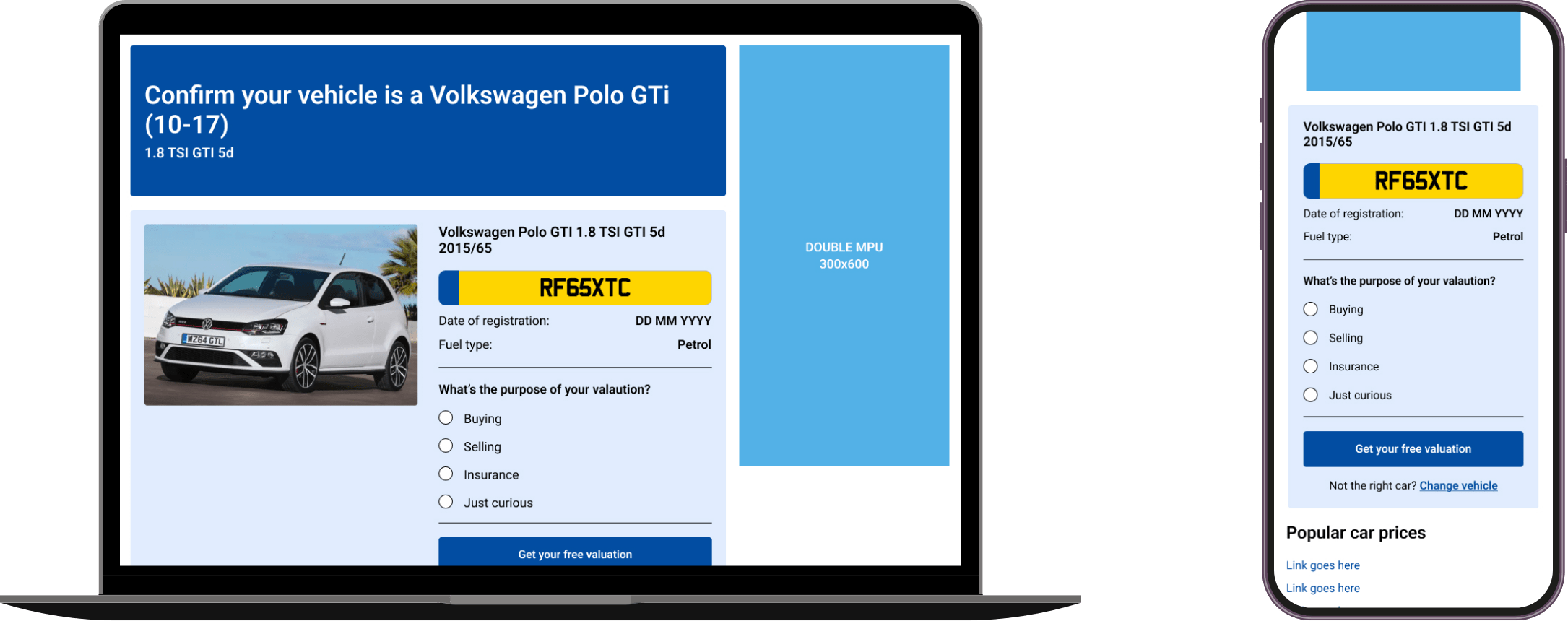
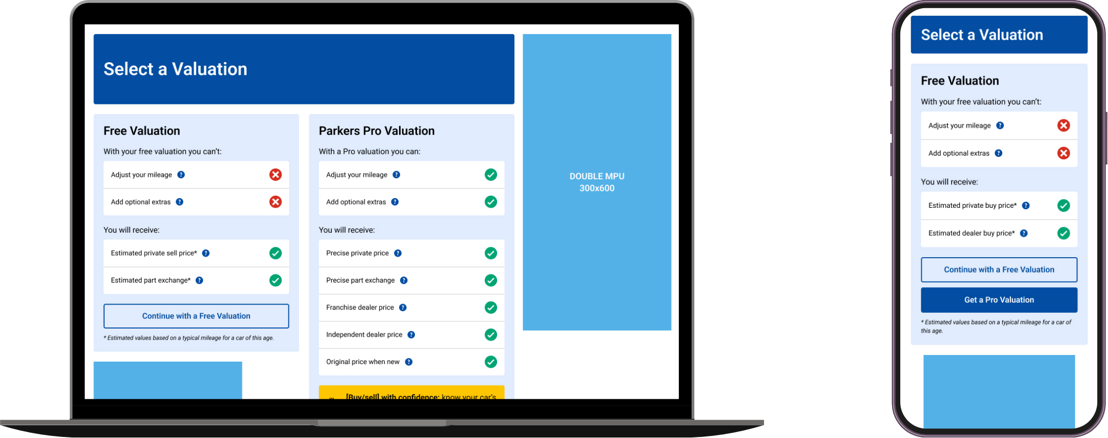
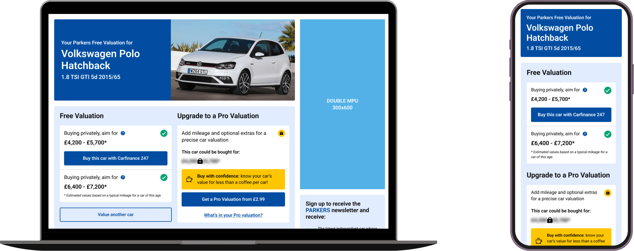
User Interface
Results & learnings
During usability testing, the redesigned experience received strong validation, with an 80% satisfaction score across eight sessions. Feedback highlighted improvements in clarity, visual hierarchy, and ease of interaction, confirming that the updated UI and UX decisions effectively reduced friction and supported key user tasks.
A key learning from this project was the value of incorporating user polls to validate hypotheses derived from research insights. This approach provided quantifiable, user-backed evidence that strengthened stakeholder alignment and proved instrumental in advocating for impactful UX and UI improvements.