PUBLISHING
PUBLISHING
What's the Best?
What's the Best?
At a Glance
Background
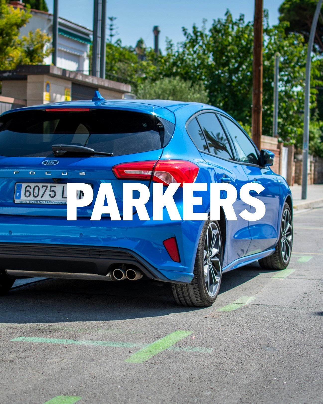
What’s The Best is a comparison and review platform that helps people make informed decisions by providing clear, unbiased insights and recommendations on products and services across a range of categories.
My Role
On this project, I led in-depth research and analysis to evaluate the effectiveness of the existing feature structure, using both qualitative and quantitative data to uncover opportunities for improvement. I translated these insights into a clear optimisation strategy, refining and prioritising the feature set within the constraints of the current interface.
The Challenge
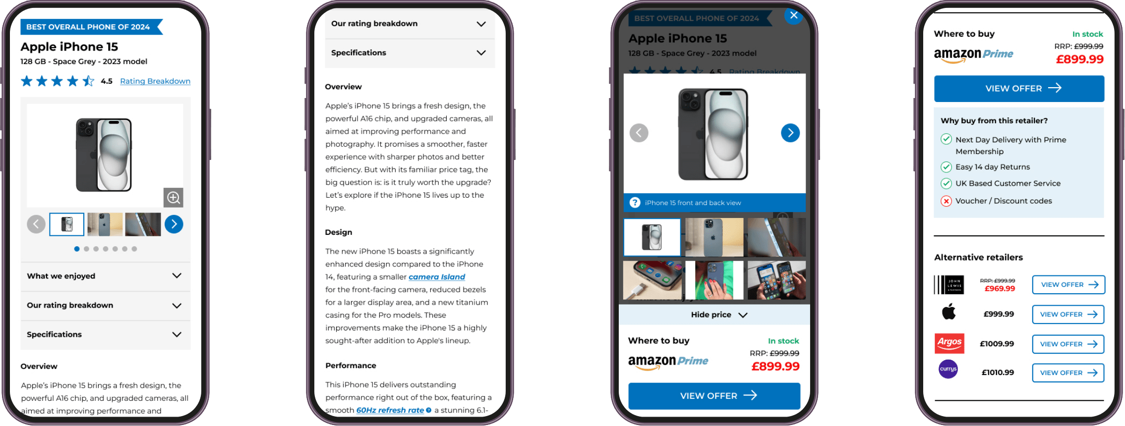
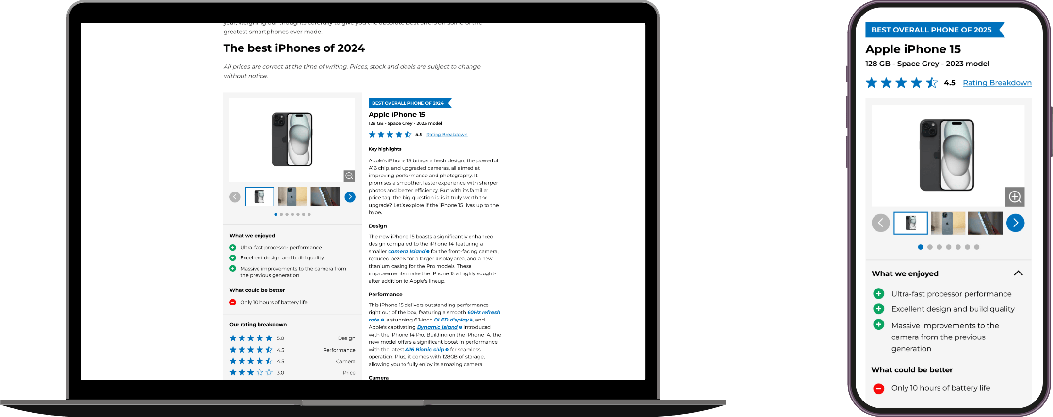
After conducting a heuristic evaluation supported by heat maps and session recordings, we identified multiple usability issues within the product card feature that were hindering user engagement. Users struggled to understand the component and complete key actions, creating friction at critical decision points in the journey.
From a UX perspective, this highlighted a need to simplify interactions, clarify information hierarchy, and reduce cognitive load to improve task completion.
Constraints
The product card was a shared, universal component used across multiple sites, meaning any updates needed to support a wide range of user groups and use cases. The solution therefore had to be flexible, allowing specific features to be enabled or disabled based on the site context and user journey.
At a Glance

Research
I began the project with a heuristic evaluation of the existing product card to identify potential usability issues and quick-win improvements. I then carried out competitor analysis to understand how similar components were implemented across the market.
Using insights from both our own component and competitor approaches, I ran a preference test to explore user perceptions and expectations. The findings were shared with stakeholders to align on technical constraints and inform the creation of multiple design variations for a new, more effective component.

Ideation
After collaborating with product and engineering to understand technical limitations and how data flowed between our systems and external partners, I began designing multiple variants of the component.
These concepts were built using existing UI elements to ensure consistency with the design system, reduce development effort, and support scalable implementation across sites.

Testing
Once the three component variants were approved by internal stakeholders, I conducted usability testing on each option, asking six users to complete a series of tasks focused on the new component.
The existing component was included as a baseline to benchmark usability and provide a clear comparison against the proposed improvements.
Following testing, I made refinements to the final component based on user feedback and presented the updated design back to stakeholders for approval.
Prototypes
User Interface
Results & learnings
Following the launch of the new product card component, we saw a 2% increase in conversions across primary calls to action, alongside a 25% increase in page session duration.
A key learning from this release was the importance of onboarding editorial teams on how to use the product card effectively and in line with user research. This involved running a workshop to introduce the component, showcase its variations, and clarify its intended use across multiple sites.
This approach supported strong adoption of the new component and was incorporated into a new UX workflow for launching future components.

Results & learnings
Following the launch of the new product card component, we saw a 5% increase in conversions across primary calls to action, alongside a 25% increase in page session duration.
A key learning from this release was the importance of onboarding editorial teams on how to use the product card effectively and in line with user research. This involved running a workshop to introduce the component, showcase its variations, and clarify its intended use across multiple sites.
This approach supported strong adoption of the new component and was incorporated into a new UX workflow for launching future components.