Using some fundamental laws of user experience to establish best practices
The laws around user experience exist to act as a foundation of knowledge for designers like myself to use and expand upon when we design a website. Some of these laws might seem self-explanatory at first and over time when you start viewing websites from the eye of a designer you will see these principles appear and you will then understand how designs have been applying these techniques for years.

So what are these core principles?

Hicks Law
Making a choice
The time it takes to make a decision increases with the number and complexity of the choices available. Example:Sometimes the user will come across complex forms that might require multiple steps in order to complete. If we as designers can reduce the complexity we can reduce the cognitive load we place on the user, allowing them to complete the task quickly and encourage a high conversion rate.

Jakobs Law
Simialarity
Users spend most of their time on other sites, and they prefer your site to work the same way as ll the others they already know. ExampleIf you decide to feature the basket call to action within a banner that can easily be missed this creates a huge amount of confusion and friction within the user's brain.Typically using the same mental models as other websites creates a superior user experience and refrains the user from trying to learn new mental models.

Fits Law
Hitting the target
The time it takes for someone to hit the target (button press) depends on its size and how far away the target is. ExampleIf you include a small button within your UI kit, this button will naturally be will be harder to hit than a bigger button.The minimum size for an effective and accessible call to action is 44px x 44px. However, going beyond this size is highly recommended due to average hand sizes and WCAG accessibility standards.
Read more about these methods

Laws of UX
Jon Yablonski

Hooked
Nir Eyal
My reading list

Design for the mind
Victor Yocco

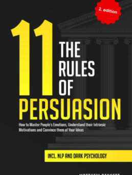
11 rules of persuasions
Matthew Bennett

Nir Eyal
Nir Eyal
Other methodologies I use
Let’s work together
I love to work with clients who wish to understand their customers and want to focus on an excellent user experience combined with a beautiful user interface.
Get in touch
Let’s work together
I love to work with clients who wish to understand their customers and want to focus on an excellent user experience combined with a beautiful user interface.
Get in touch


