Charity
Charity
Turning Point
Turning Point
About Turning Point
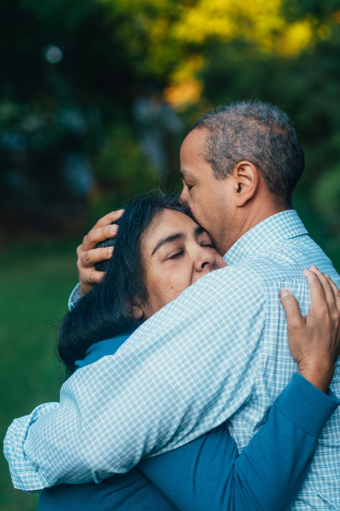
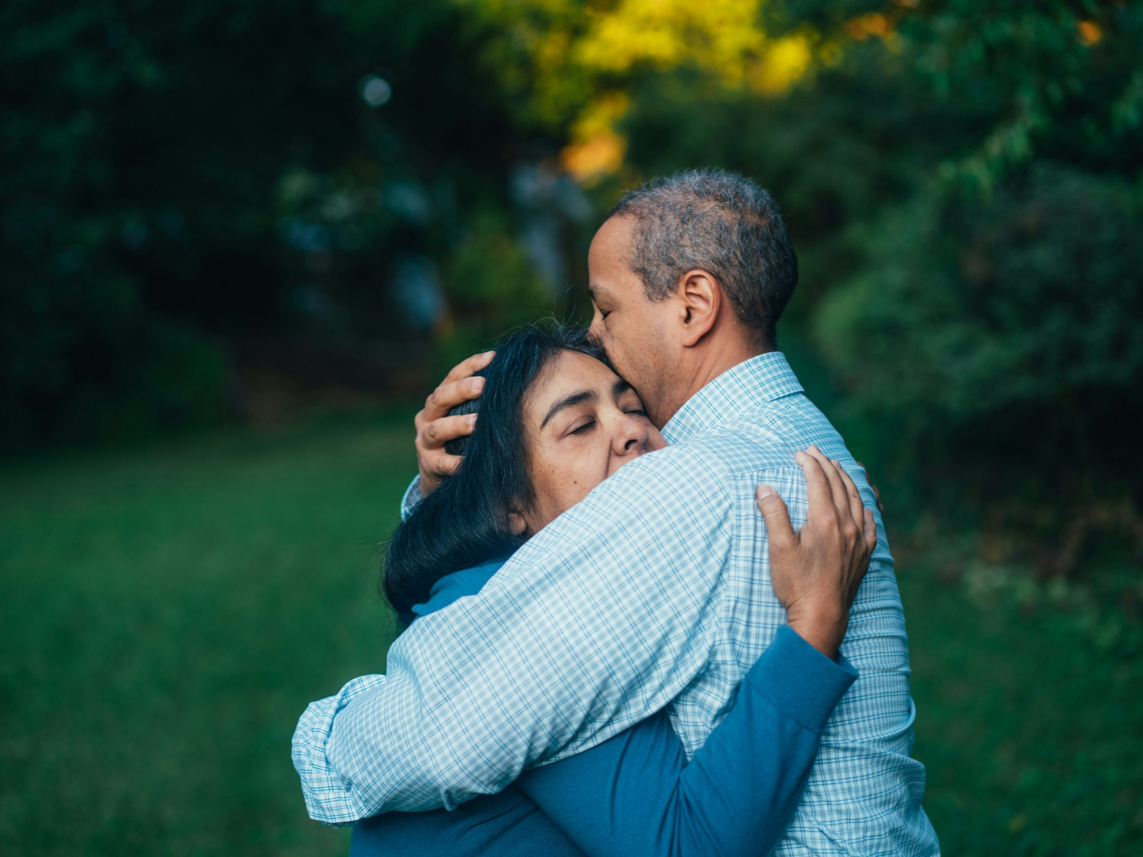
Turning Point is a UK health and social care organisation that provides community-based support for people facing mental health challenges, substance use, learning disabilities, and other complex needs, helping individuals improve their wellbeing and lead more independent lives.
My Role
I led user research with care providers to build a deep understanding of the nuances across each user journey, informed by the different types of support required. I synthesised these insights to define clear experience principles, then translated them into wireframes and drove the design of an updated user interface that delivers a seamless and intuitive experience for each user group.
The Challenge
Turning Point provides support for a wide range of users, including those with special accessibility needs. As their services expanded across the UK, the website became increasingly complex, with overlapping user journeys that made it difficult for all users to find the information they needed. The organisation needed a new, inclusive user interface capable of serving multiple user types, both individuals seeking support and organisations looking to sponsor or engage, while ensuring accessibility and a seamless experience for all users.
Constraints
The project timeline was shortened to align with the client’s quarterly budget, which required much of the research to be conducted remotely and in parallel with wireframing and design. This overlapping approach ensured the project met its deadline without compromising quality.

Research
-
Conducted a heuristic evaluation of the existing website to identify accessibility issues and friction points
-
Used findings to inform and structure user interviews across multiple user groups
-
Validated assumptions and gained deeper insight into diverse user needs
-
Developed detailed user personas grounded in research insights
-
Mapped tailored user journeys for each persona to ensure alignment with real user goals and behaviours
-
Ensured all design pathways were informed by evidence and focused on improving the overall user experience

Ideation
-
Translated defined user journeys into high-fidelity wireframes, mapping user navigation to key areas of interest
-
Conducted stakeholder reviews of each wireframe to validate approach and alignment with user group needs
-
Iterated wireframes into a refined user interface that balanced usability with brand integrity
-
Introduced greater consistency across typography, colour usage, and imagery to strengthen visual hierarchy and coherence
-
Ensured design solutions were both user-centred and scalable within existing brand guidelines

Testing
-
Applied the refined user interface to the wireframe structure to create interactive prototypes
-
Conducted usability testing with participants from each defined user group
-
Designed task-based scenarios informed by insights from preliminary research
-
Collected and analysed qualitative feedback to identify friction points and validate usability
-
Iterated and refined user journeys based on testing insights
-
Presented findings and actionable recommendations to stakeholders to guide next-stage design decisions
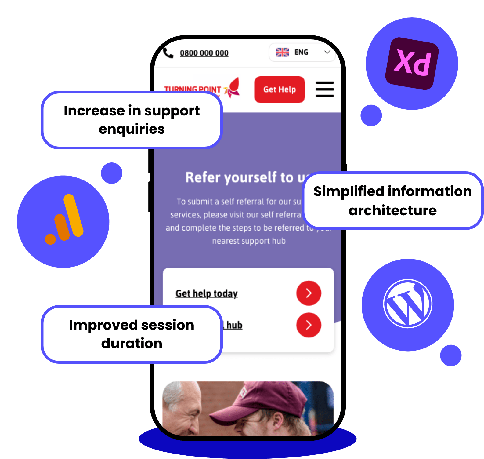
Results
Six months post-launch, Turning Point experienced a marked increase in support enquiries, reflecting the effectiveness of the newly designed user journeys and simplified information architecture. The redesigned interface was positively received by users and drove measurable improvements in key metrics, including click-through rates and session duration.
Learnings
A critical insight from this project was the importance of balancing seamless user journeys with robust accessibility standards. Leading the initiative, I ensured that design decisions considered the full spectrum of users, including those with learning disabilities, through careful attention to colour, typography, and language. This approach not only delivered an inclusive and frictionless experience but also established a framework for future design work, embedding accessibility and user-centred thinking at the strategic level.
Results
Following the launch of the redesigned product card component, we observed a 5% increase in conversions across primary calls to action and a 25% increase in page session duration, demonstrating measurable improvement in user engagement.
Learnings
A key insight from this release was the critical role of onboarding editorial teams to ensure the component was used effectively and aligned with user research. I led a workshop to introduce the component, showcase its variations, and clarify its intended usage across multiple sites. This approach not only supported strong adoption but also informed the creation of a new UX workflow for launching future components, embedding research-driven practices into the design process and enabling more consistent, scalable outcomes.