CHARITY
CHARITY
Turning Point
Turning Point
Background
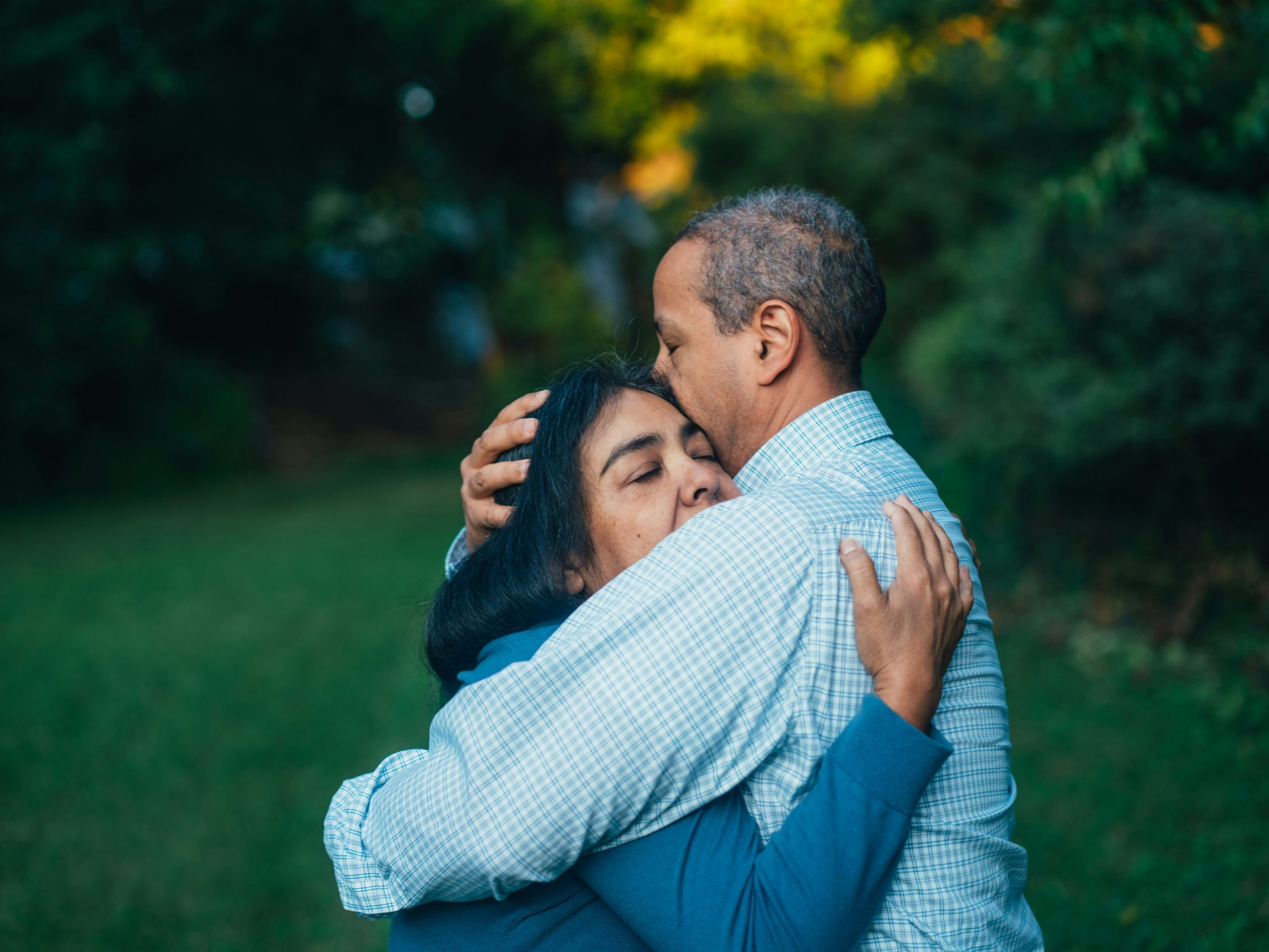
Turning Point is a UK health and social care organisation that provides community-based support for people facing mental health challenges, substance use, learning disabilities, and other complex needs, helping individuals improve their wellbeing and lead more independent lives.
My Role
On this project, I led the research, ideation, and design phases to build a deep understanding of the diverse needs and workflows of care providers and users. I combined these insights to define clear experience principles, which guided the creation of wireframes and the design of a refreshed user interface. The updated interface delivers a clear accessible experience tailored to each user group, improving task efficiency, reducing friction in complex workflows, and ensuring that the platform effectively supports the range of care services provided.
The Challenge
Turning Point provides support for a wide range of needs, and as their services expanded across the UK, the website structure became increasingly complex, with multiple overlapping user journeys. They required a new website that would resonate both with people seeking support and with organisations looking to sponsor and support their work.
This project involved a deep dive into user research, developing clear personas for each audience, and designing intuitive user journeys that ensured every user could quickly find the information most relevant to them.
Constraints
The project timeline was shortened to align with the client’s quarterly budget, which required much of the research to be conducted remotely and in parallel with wireframing and design. This overlapping approach ensured the project met its deadline without compromising quality.

Research
I began the project with a heuristic evaluation of the existing experience to identify key usability issues and friction points across the journey.
These insights informed a series of stakeholder interviews across multiple departments, where I validated initial hypotheses and gained a deeper understanding of business needs and user requirements.
Compiling this research, I developed clear user personas and mapped tailored user journeys for each group. These journeys were then presented back to stakeholders for validation, ensuring alignment before progressing into wireframing.

Ideation
I used the defined user journeys to create high-fidelity wireframes that mapped how users navigate to their key areas of interest.
Each wireframe was reviewed with key stakeholders to validate the proposed approach for each user group.
I then evolved these wireframes into a refined user interface that retained existing brand elements while introducing greater consistency across typography, colour usage, and imagery.

Testing & Delivery
Once the user interface was applied to the wireframe structure, I conducted usability testing across key user groups, asking participants to complete task-based scenarios informed by earlier research.
Insights from these sessions were used to refine user journeys, addressing friction points and improving task success rates. I then presented findings and recommendations back to stakeholders to ensure alignment on the proposed improvements.
Building on this, I developed an updated design system to support the complex and varied accessibility needs of users, ensuring consistency and inclusivity across the experience. The final UI templates were reviewed with stakeholders for feedback before being handed over to the development team for implementation.
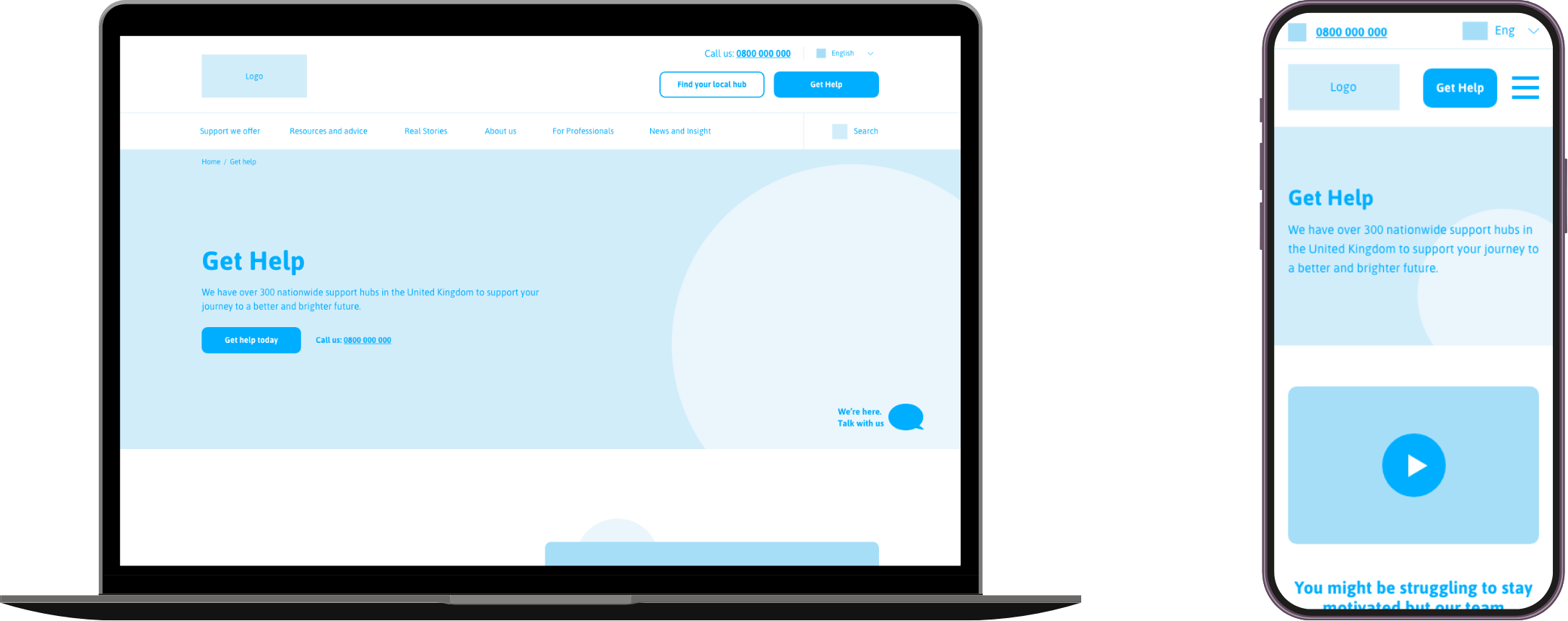
Wireframes
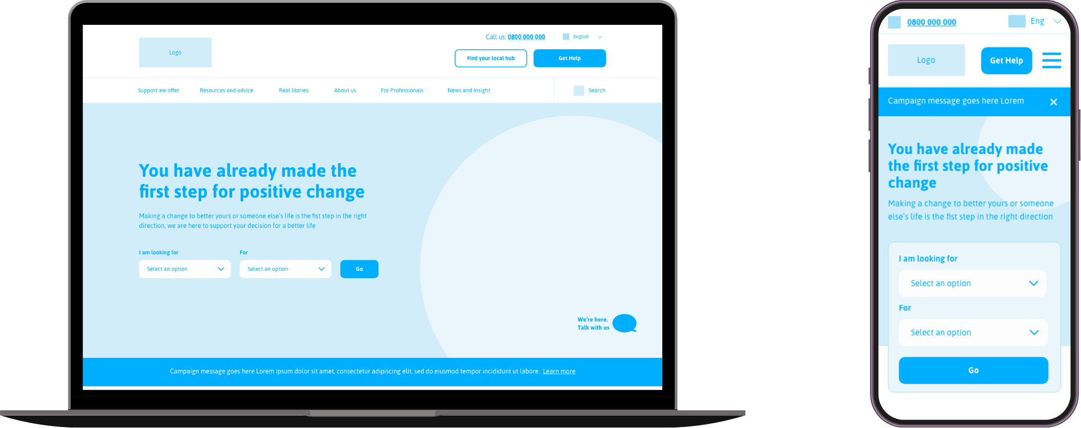
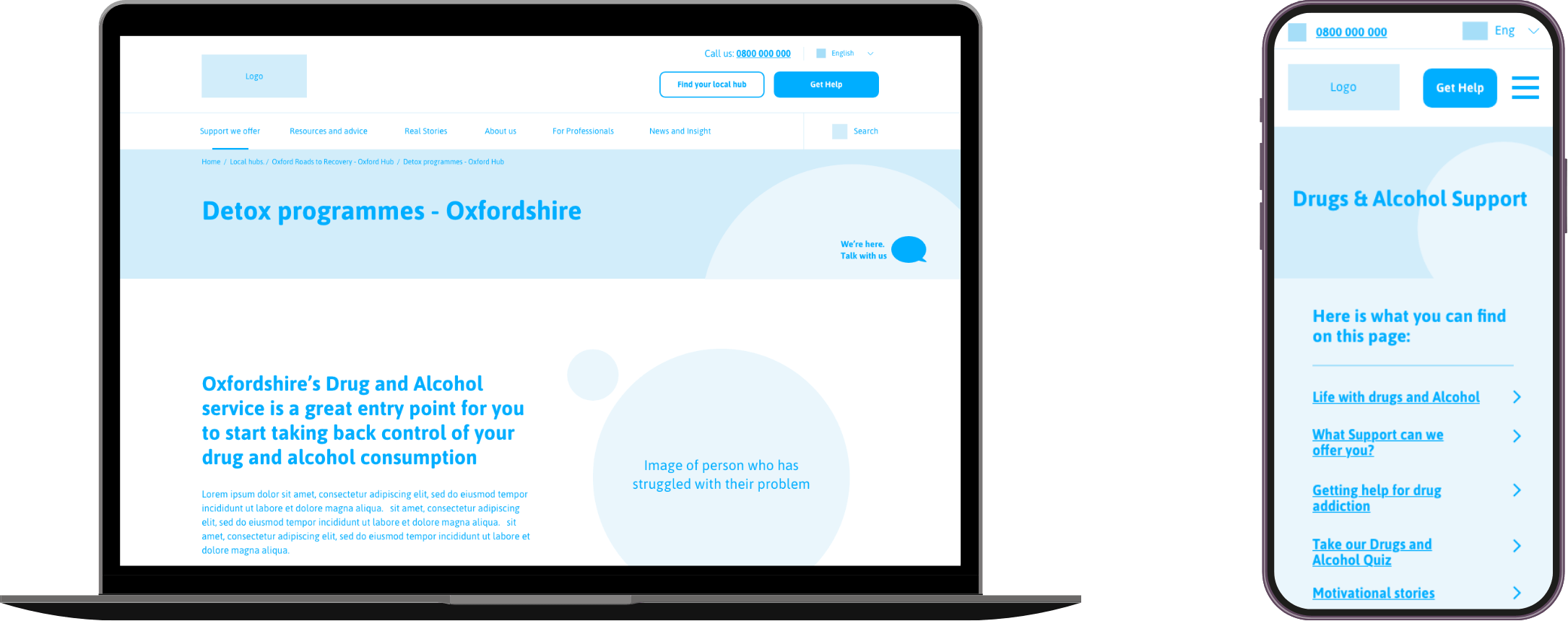
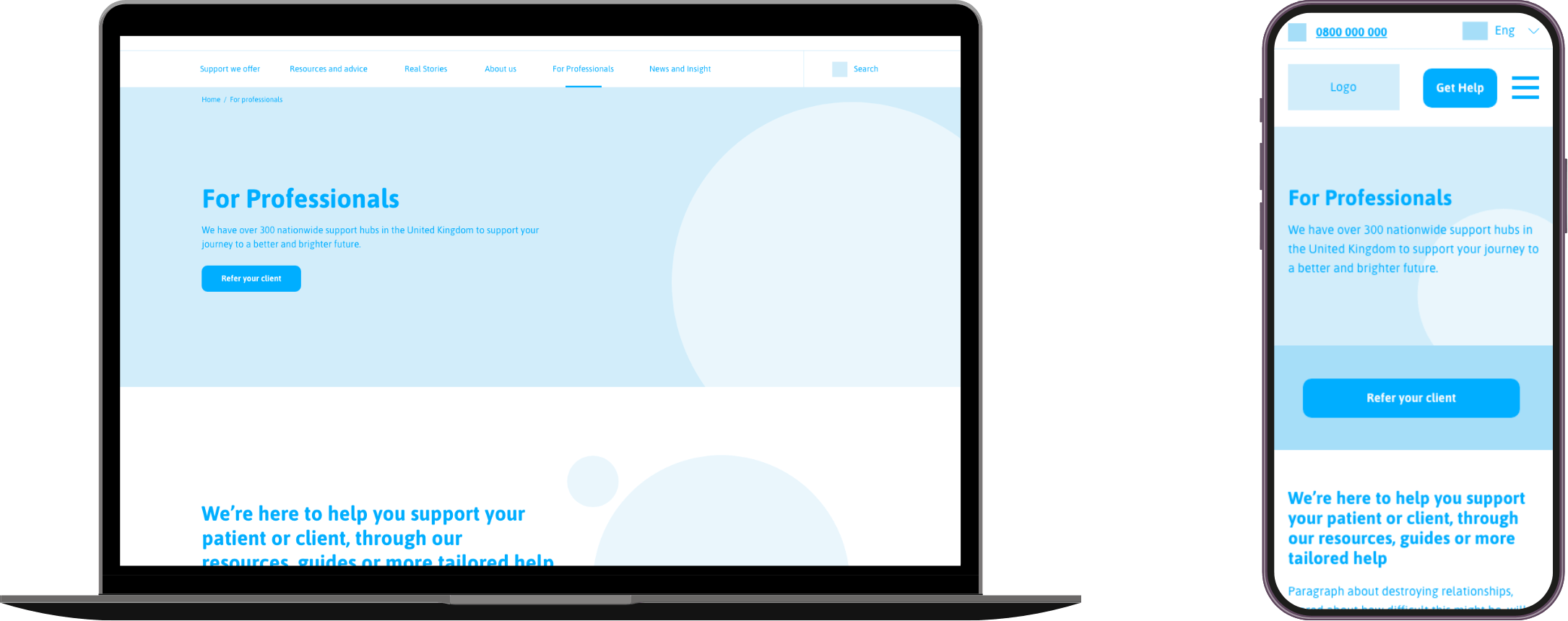
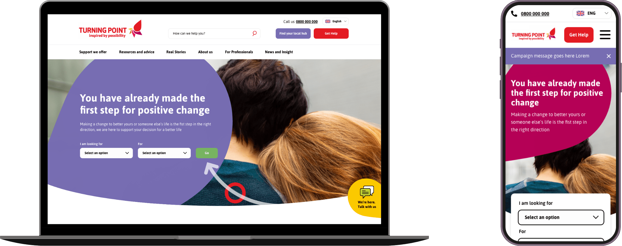
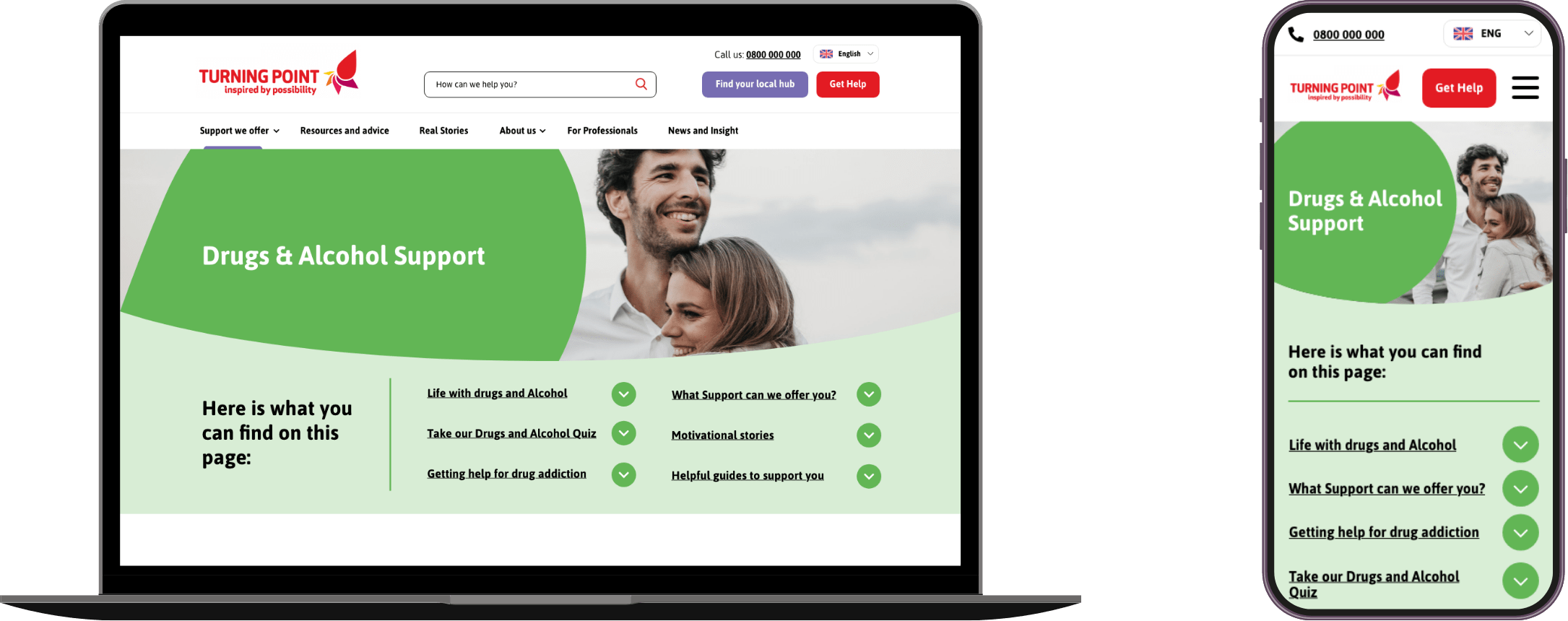
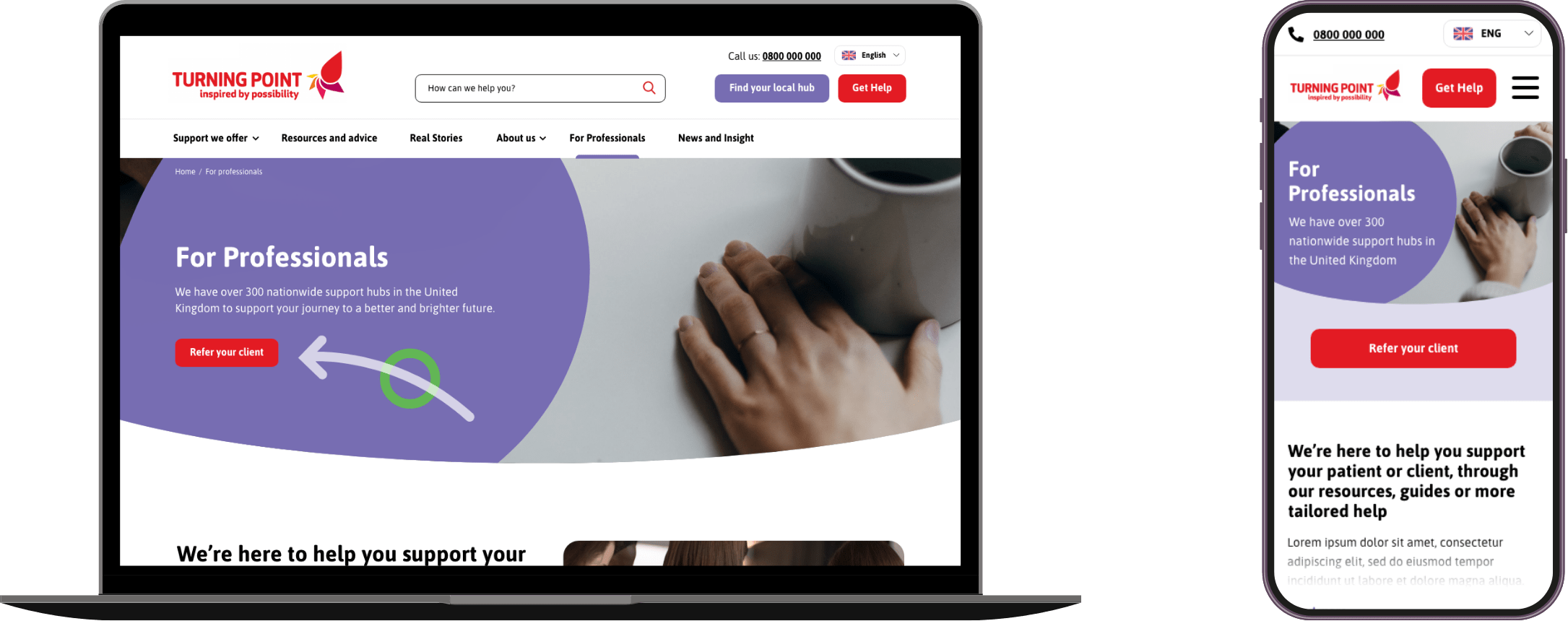
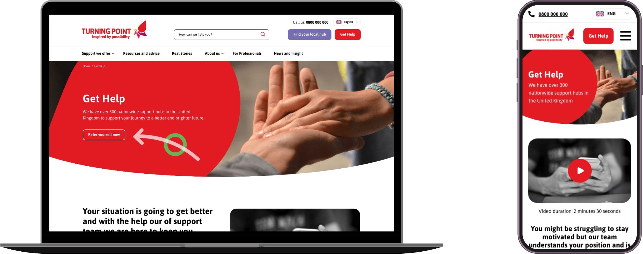
User Interface
Results & learnings
Six months after launch, Turning Point saw a 16% increase in support enquiries, driven by the new user journeys and simplified taxonomy. The updated user interface was well received by users and led to improvements in key metrics, including click-through rate and session duration.
A key learning from this project was that creating a frictionless journey for all user groups must go hand in hand with meeting accessibility standards. Given the diverse range of users, including those with learning disabilities, careful consideration of colour, typography, and language was essential to delivering an inclusive user experience.